Button
Introduction
A button is used to initiate an action. A button can include text, and icon or both, and has various styles to indicate action hierarchy.
Live demo
- Core
- React
- Rails
Features
| Feature | Core | React | Rails |
|---|---|---|---|
| Type | ✅ | ✅ | ✅ |
| Size | ✅ | ✅ | ✅ |
| Link | ✅ | ✅ | ✅ |
| Icon | ✅ | ✅ | ✅ |
| Icon position | ✅ | 🚧 | ✅ |
| Icon Only | ✅ | 💬 | ✅ |
| Full width | ✅ | 🚧 | 🚧 |
| Disabled | ✅ | 💬 | ✅ |
✅ = Suported
💬 = Yes but named differently to core
🚧 = Not implemented
❌ = Will not support
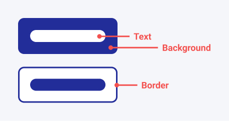
Anatomy
CSS custom properties
These properties can be used to customise the component. These should be used instead of overriding styles directly to avoid backwards incompatible changes. You can experiment with these properties in the Button component storybook on design-system-core.
See more details on theming here.
Currently overrides should be applied to.rpf-button, this may change to :root, :host but .rpf-button will be backwards compatible.
| Property | Description | Default Value |
|---|---|---|
--rpf-button-background-color | The background color of the button | var(--rpf-navy-800) |
--rpf-button-background-color-hover | The background color of the button on hover | var(--rpf-navy-900) |
--rpf-button-background-color-active | The background color of the button on active | var(--rpf-navy-600) |
--rpf-button-background-color-disabled | The background color of the button when disabled | var(--rpf-grey-600) |
--rpf-button-text-color | The text color of the button | var(--rpf-white) |
--rpf-button-border-color | The border color of the button | var(--rpf-button-background-color) |
--rpf-button-border-color-hover | The border color of the button on hover | var(--rpf-button-background-color-hover) |
--rpf-button-border-color-active | The border color of the button on active | var(--rpf-button-background-color-active) |
--rpf-button-border-color-disabled | The border color of the button when disabled | var(--rpf-button-background-color-disabled) |
--rpf-button-danger-background-color | The background color of the button when the variant is danger | var(--rpf-alert-error) |
--rpf-button-danger-background-color-hover | The background color of the button when the variant is danger on hover | var(--rpf-alert-error) |
--rpf-button-danger-background-color-active | The background color of the button when the variant is danger on active | var(--rpf-red-900) |
--rpf-button-danger-background-color-disabled | The background color of the button when the variant is danger and disabled | var(--rpf-grey-600) |
--rpf-button-danger-text-color | The text color of the button when the variant is danger | var(--rpf-white) |
--rpf-button-danger-border-color | The border color of the button when the variant is danger | var(--rpf-button-danger-background-color) |
--rpf-button-danger-border-color-hover | The border color of the button when the variant is danger on hover | var(--rpf-button-danger-background-color-hover) |
--rpf-button-danger-border-color-active | The border color of the button when the variant is danger on active | var(--rpf-button-danger-background-color-active) |
--rpf-button-danger-border-color-disabled | The border color of the button when the variant is danger and disabled | var(--rpf-button-danger-background-color-disabled) |
--rpf-button-border-radius | The border radius of the button | var(--border-radius) |
--rpf-button-border-width | The border width of the button | var(--border-width-md) |
Variants
General variant guidelines, these should be used to guide designs but are strict rules.
An affirmative action is something that takes the user further in their journey (for example, Save or Delete), while a dismissive action takes a user back (for example, Cancel). Depending on the context, an affirmative action may be destructive.
Source: Gitlab Pajamas
Primary
- Should be used as the core action for a section or page.
- Used as affirmative action.
- Where possible limit to 1 primary button per section/button group.
- Be aware that users will likely be drawn to the primary button when paired with other variants.
Secondary
- Can be used stand-alone when it is the not the primary action of the section/page.
- Often used to accompany a primary button.
- Used as the dismissive action.
Tertiary
- Used to provide a deprioritised action.
Icons
Buttons have the option to have an icon on either side.
There are no specific guidelines on what side to use the icon, but when using multiple buttons with icons in close proximity use a consistent side.
Icon only button
Buttons have the ability to be icon only.
Try to only use icon only buttons in places where the resulting action is obvious or the icon is commonly understood. Where possible a text + icon button is preferred.
Icon buttons could also be used as a collapsed version of a text + icon button in small variations of a component/page. This means where the space is available text will be shown but we save space when it is limited.
Add guidance on aria-label / alt? - Implementation?
Small size:
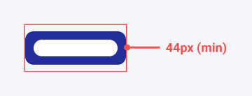
The small size button is used when vertical height is limited, for example in the navigation. Although appearing smaller, the button has a target size of 44px in height, this is smaller than the 48px target size of the default size button but still WCAG 2.1 AAA compliant.
Add link to navigation when page is available
Danger
A danger button should be used when the resulting action is irreversible. Where possible and suitable a danger button should be followed by a requesting confirmation from the user e.g. "Are you sure you want to delete this item?".
When to use
Disabled buttons
Try to avoid using disabled buttons where possible. Disabled buttons do not provide the user with any additional information when clicked, this could lead to the user being unsure why they cannot proceed with the action. Instead keep the button enabled but show the user an error message when actioned, this provides them information as to why they cannot proceed with the action.
Disabled buttons are also not keyboard focusable. Keep this in mind when using disabled buttons, this could be used to your advantage, but may also cause issues for keyboard users.
How to use
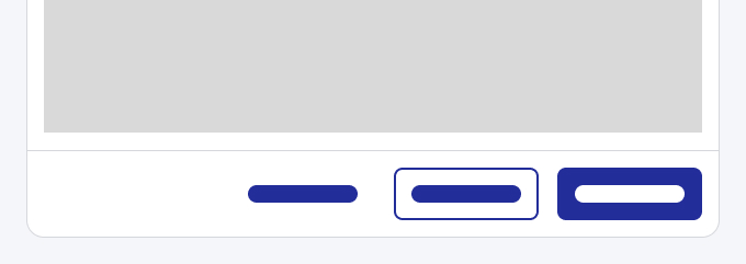
Button grouping
In the following notes we avoid using 'left' or 'right' to describe position as these will flip depending on reading direction. Therefore with LTR (left to right) languages first = left, and with RTL (right to left) languages, first = right.
Multiple actions
When using multiple buttons together try to avoid having more than 1 primary button if possible.
Spacing
When grouping buttons they should have a gap of --space-2 (1rem). This is the same if side by side or stacked.
Order of buttons
Buttons should always be ordered relative to their hierarchy i.e. primary > secondary > tertiary.
Side by side:
-
If in-page, the primary action should be the first button. So in LTR languages the primary button will be the left most with lower hierarchy buttons to the right.

-
If in a form or modal, the affirmative action (primary) should be closest to the edge, so in LTR, all buttons are aligned to the right, and the primary button is the right most.
Stacked:
-
Affirmative action (Primary button) is on top then decreasing in hierarchy below that.

Stretching
Buttons can stretch to fill the width of the screen/component where we feel the extra affordance feels needed. For example this can help on mobile to create a wider touch target.
Add guidance on max-width
External link
When using a button to link to an external site, we use the right icon variant on the button with the external link icon.
Related
- Link component
Implementation:
See Storybook docs
Theming
- Elements available to theme
- Examples