Spacing
Our Design System uses an 8px spacing system. This system is used in our components and layouts within our products. Using this system decreases complexity of designs and creates a consistent visual rhythm across our products.
Although we describe this as an 8 'pixel' system, the spacing is in fact defined in rems.
Values
- In Figma these are provided as 'Variables'.
- In development these are provided as CSS custom properties.
| Property | Value | px eqv. (1rem = 16px) |
|---|---|---|
--space-0-125 | 0.0625rem | 1px |
--space-0-25 | 0.125rem | 2px |
--space-0-5 | 0.25rem | 4px |
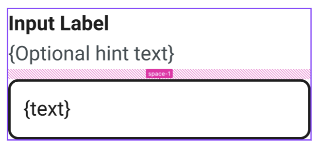
--space-1 | 0.5rem | 8px |
--space-1-5 | 0.75rem | 12px |
--space-2 | 1rem | 16px |
--space-3 | 1.5rem | 24px |
--space-4 | 2rem | 32px |
--space-5 | 2.5rem | 40px |
--space-6 | 3rem | 48px |
--space-7 | 3.5rem | 56px |
--space-8 | 4rem | 64px |
--space-9 | 4.5rem | 72px |
--space-10 | 5rem | 80px |
Outliers
1px, 2px, 4px
Theses sizes are reserved for spacing within components only and for small details like borders, outlines etc.
12px
This size should be used sparingly and only within components.
Implementation
Figma
Where possible you should try to use these spacing variables in your designs in Figma, doing so will highlight these variables in dev mode, making designs a lot easier to inspect.
Development
As long as you have the Design System added to your project then the CSS custom properties should be available to you.
Load the spacing styles into your stylesheet:
@use "@raspberrypifoundation/design-system-core/scss/properties/spacing";
Use the custom properties as follows:
.element {
	padding: var(--space-2);
}