Colours
Introduction
The Design System has a set of colours available to use as CSS custom properties.
Naming scale
Our current naming scale goes from color-50 to color-950. Generally incrementing in 100s but occasionally 50 when smaller steps are required.
You will notice in some palettes some steps are missing. This is for a few reasons:
- When migrating from the old palettes to the current ones, our needs at time required some palettes were larger than others.
- As we plan on expanding the palettes in the future the missing intervals make it easier to add new steps in the scale with fewer breaking changes.
Accessibility
We work towards the following WCAG Success Criteria:
Understanding contrast ratings
Each colour has 2 contrast ratings. The first (shown with a black background), shows the contrast with black text (shown with a white background) shows the contrast with white text.
PASS = Can be used for text.
LG TXT = Can only be used for large text. Also passes Non-text Contrast (Level AA),
FAIL = Does not meet contrast requirements. Can not be used for text or non-text contrast elements.
Examples:
So for this example we can see that --rpf-raspberry-500 passes contrast with black text (7.44) but fails with white text (2.82). Black text paired with --rpf-raspberry-500 only passed with large text.
Illustrations
Where possible we try to stick to using all of the colours within the Design System even with illustrations in order to have consistency between UI elements and illustrations.
Add link to illustration guidelines when available.
Products
Foundation branded products
Products we would consider as Foundation branded include:
Typically products in the Foundation brand follow these styles:
- Use of raspberry when we want to create strong brand recognition.
- Use of decorative colours especially with young learner related sections/pages.
- Use of navy for educator related sections/pages.
- Use of navy for actionable elements like buttons.
raspberrypi.org
raspberrypi.org, as expected, is the product at uses the raspberry as its core decorative colour.
Projects
The projects site avoids using Raspberry and instead as a strong use of decorative colours due to the audience of the site being young learners.
Editor
The editor theme is very close to the core brand however it uses teal in place of Navy. It also has a dark mode which follows these guidelines
Experience AI
Experience AI pushes the use of navy dude to it's core audience being educators, however it uses touches of the decorative colours too in illustrations.
Implementation
To include these in your styles use Sass @use.
Usage
@use "@raspberrypifoundation/design-system-core/scss/properties/colors/*";
Brand
Usage
@use "@raspberrypifoundation/design-system-core/scss/properties/colors/brand";
Core brand
We include the 3 core brand colours for the RPF brand.
These are not to be used to style UI elements and are only available for core brand elements like logos etc.
Raspberry
In places where the RPF branding is prominent, such as on raspberrypi.org there are a set of raspberry red colours that can be used to style UI elements.
Greyscale
Usage
@use "@raspberrypifoundation/design-system-core/scss/properties/colors/greys";
Overview
We have a wide range of greys available to use. These has a wide range of applications. All the grey are tinted towards blue. this gives them a cooler appearance and makes them them sterile.
Off-white
The off-white colour is inherited from older versions of the design system. However we decided to keep it as it provides a cooler grey that can be used as a background colour in light UIs.
White & Black
White and black are available as named colours rather than in the greyscale. We've just found this to be more usable, however we could alias these to a grey in to future if the need should arise, e.g. --rpf-white → --rpf-grey-0.
Greys
Of course a larger greyscale is also available. These greys are tinted towards the blue for a cooler (tone not 😎) appearance.
Dark mode layers
Dark mode styles are still WIP
This is how we are currently using our grey scale to create layers in dark mode & light mode.
Note that the layers are not yet available in the design system.
| Layer | Light | Dark |
|---|---|---|
| layer-1 | --rpf-off-white | --rpf-grey-850 |
| layer-2 | --rpf-white | --rpf-grey-800 |
| layer-3 | --rpf-white | --rpf-grey-700 |
| outline | --rpf-grey-150 | --rpf-grey-600 |
Editor dark mode example
Add better example image from editor, showing dark mode / light mode
Text
Usage
@use "@raspberrypifoundation/design-system-core/scss/properties/colors/text";
We have a dedicated colours that should be used as the default for text.
These have been specifically chosen as they are not as harsh as using --rpf-black but are still have a AAA (Enhanced) contrast rating.
Light mode (default):
Dark mode:
Dark mode is not officially supported in the design system however this should be used for apps that do, such as our [editor]https://editor.raspberrypi.org).
These are the colours that should be used for primary and secondary colours respectively.
Decorative
Usage
@use "@raspberrypifoundation/design-system-core/scss/properties/colors/decorative";
We have an array of decorative colours that can be used within our UI.
Decorative elements
As a rule of thumb these colours should be used for decorative elements, so that there there is a reduced risk of accessibility issues.
Text and UI elements
However, in these colours can be used for UI elements including text sparingly, as long as Non-text Contrast requirements are met (3:1 contrast ratio) for non-text elements, and Text Contrast (Enhanced)(Level AAA) is met for text.
If you wish to use the decorative colours in this way you MUST test the colour contrast requirements fir
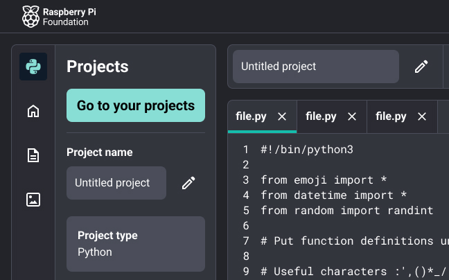
An example of using these decorative colours for UI element is our editor which has adopted the teal colour as its 'brand' colour.
Add image / link
Another example are the blog cards featured on the raspberrypi.org site.
Add image / link
Accessible combinations
It's worth mentioning that accessible combination of different tones within 1 colour are possible. For example the combination of --rpf-color-100 and -rpf-color-900 in all colours has a contrast ratio of 7:1 or higher, meaning this combination can be used with text. As seen in the blog card example above.
Further work is to be done in the future to ensure a consistent colour contrast across all colours at each tone. i.e. --rpf-red-200 should have the same contrast rating as --rpf-blue-200.
This would also us to create colour pairs and ensure accessibility across all the colours.
Red
Green
Teal
Orange
Yellow
Purple
Navy
Blue
Alert
Usage
@use "@raspberrypifoundation/design-system-core/scss/properties/colors/alert";
These colours are used within our UIs to represent different levels of alerts to the user.
Information
Success
Warning
Error
Utility
Usage
@use "@raspberrypifoundation/design-system-core/scss/properties/colors/utility";
These colours have specific utility uses
--rpf-overlay